As a developer, we rely heavily on mapping tools to gain a better understanding of the world around us, how it's changed over time, and to help solve problems for our communities.
We employ these technologies to help us develop solar power installations in a more sustainable and less invasive manner. Free mapping tools have exploded in recent years due to a growing requirement for data-driven design and the ever-increasing availability of open datasets.
Here are five free mapping tools that you may find interesting.
EPA EnviroMapper
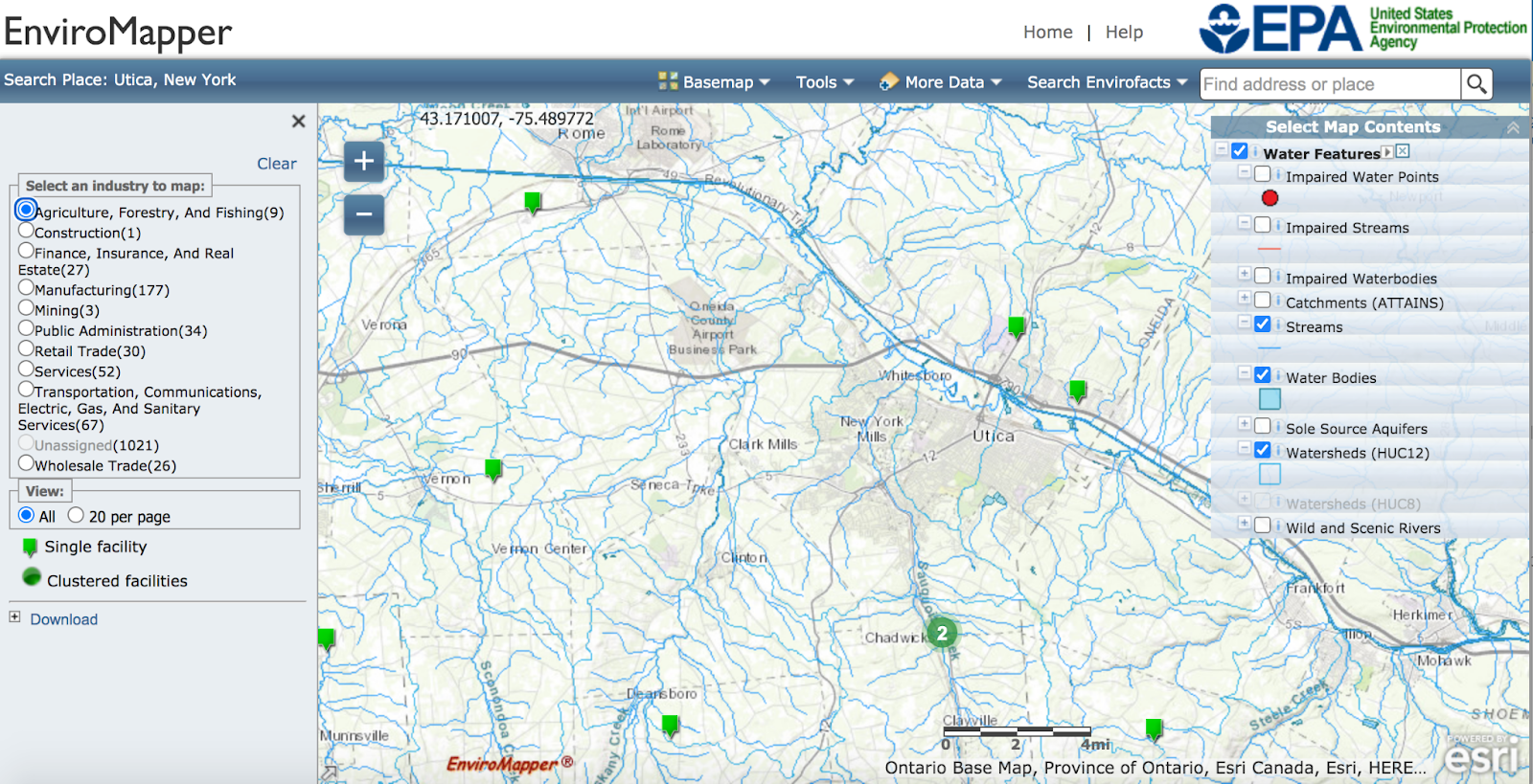
Above features an example of what EnviroMapper can provide. With the location set to Utica, New York, we input that we wanted to look at streams, water bodies, and watersheds by going to More Data → Additional Data Layers → Water Features. The Agriculture, Forestry, And Fishing industry layer was then added by following Search Envirofacts → Search by Industry → and selecting the industry chosen.
This is just one example of the layers you can add to your own map for any area you choose. EnviroMapper is a great tool for anyone looking to learn more about their community, farmers, business owners, and those looking to move somewhere new.
CropScape
We can best describe CropScape as every farmer’s dream program, as it not only classifies land files, but it is also user friendly especially for those new to the program.
CropScape provides data that can be useful for farmers wanting to look back on past plotting trends to help them better prepare for the next season. In fact, CropScape provides nearly two decades’ worth of data starting from 2002.
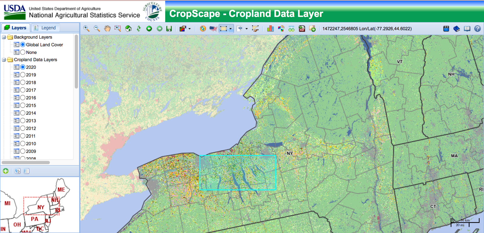
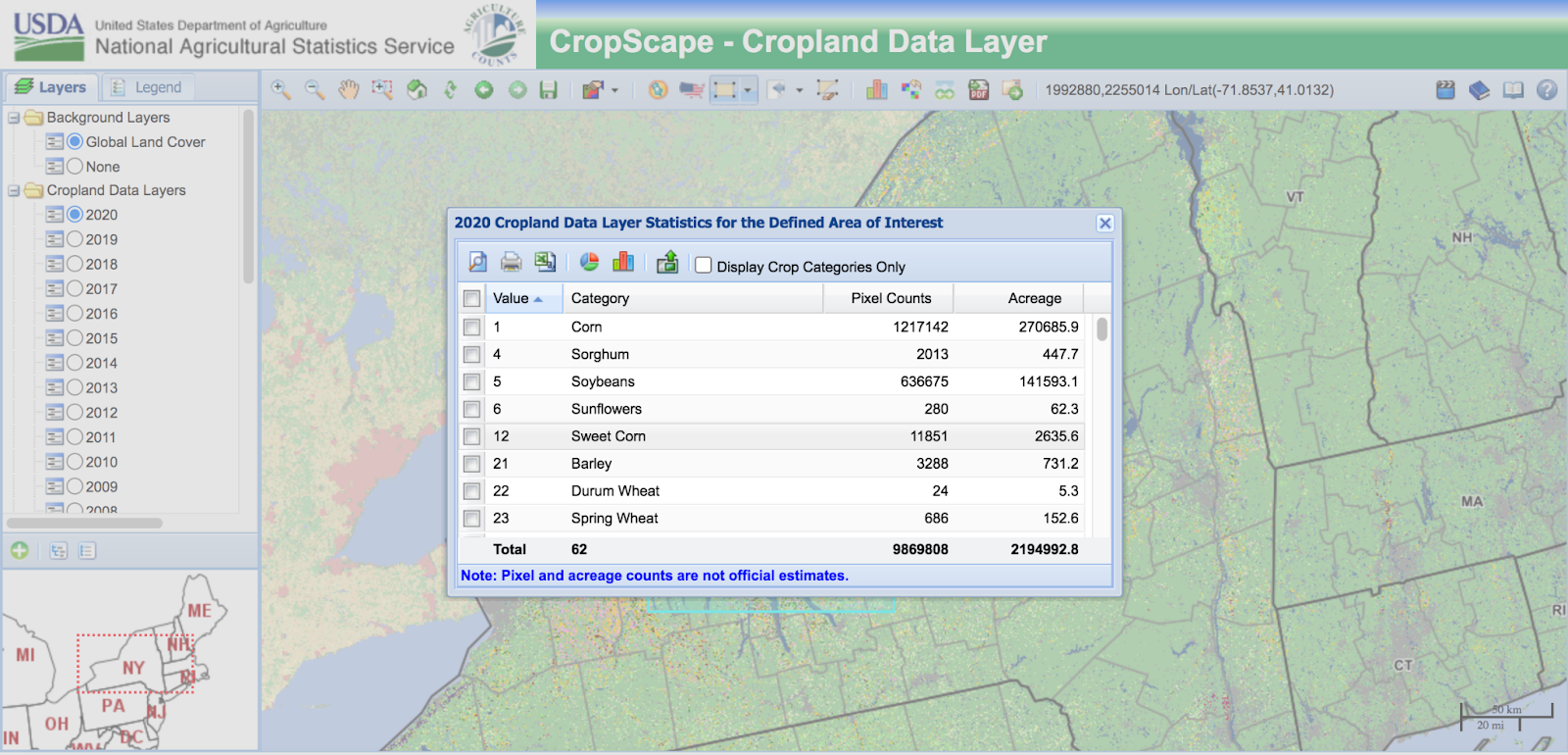
The above images show an example of the data that CropScape provides. By selecting a year and an area of interest (the blue highlighted area underneath the data box,) you are instantly provided with data on the type of crop grown, pixel count, and the acreage.
CropScape would be best utilized by farmers and those in the agriculture field.
FEMA National Flood Hazard Layer
FEMA’S National Flood Hazard Layer is pretty self-explanatory- it shows flood planes for any available area (dictated in red on their map) and flood-related risks. The program features many key tools that will be important depending on your geographical location and makeup.
Key data features for first-time users are Base Flood Elevation, Levees, Flood Hazard Boundaries, and Flood Hazard Zones. Another feature FEMA provides is the NFHL Print Tool, the first data tool available when you first open the program. The user can set it to any city, town, village, etc. they desire, and the tool will then provide a free download with a key on how to read the map.
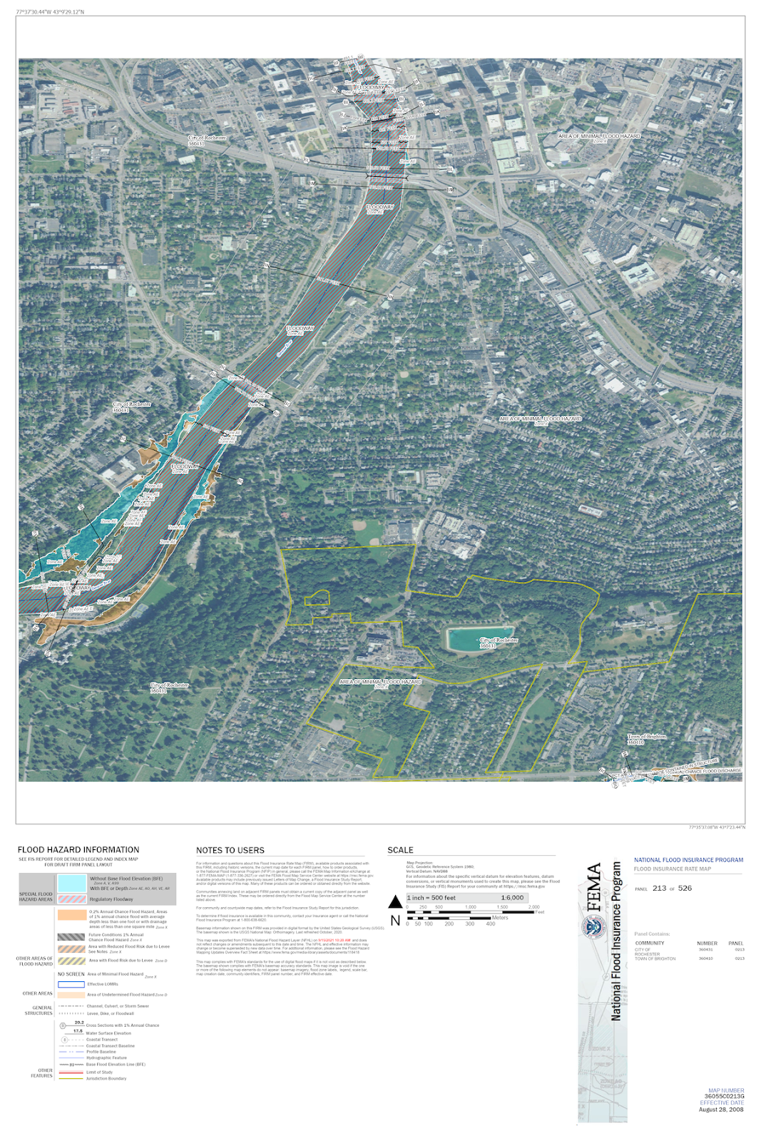
Above is an example of what a map will look like when downloaded. This one is from Rochester, New York, with the Genesse River. The river and its associated flood hazard areas and featured information is color coded to help with decoding.
Overall, FEMA’s National Flood Hazard Layer tool is decently user-friendly and is a great tool for homeowners and farmers.
New York Traffic Data Viewer
A tool best befitting homeowners and homeowners-to-be, the Traffic Data Viewer will give the low-down on nearly everything having to do with traffic. This includes traffic volume, speed limits, the morning, afternoon, and evening peaks, and other data concerning AADT (annual average daily traffic) concern.
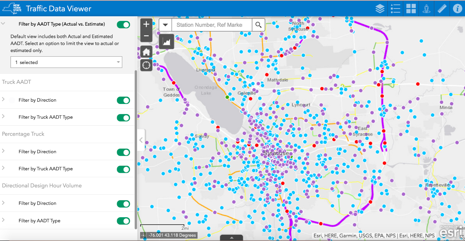
Pictured above is an example of what data points will look like for a given area. In this example, we are using Syracuse, New York, and the surrounding area. Each data point is filled with varying data like the aforementioned, and more, as it pertains to each unique point.
The Traffic Data Viewer would be highly useful for those looking to learn more about the area they live or are looking to move to. Traffic plays a heavy part in the work commute and travel sectors of our lives, and it’s never a bad thing to be too prepared for it.
New York Environmental Resource Mapper
New York’s Environmental Resource Mapper provides details on different wetland classifications and other local habitats. This tool also shows unique geological features that are protected by the state and federal government (although, it will not tell the user exactly what is being protected, for obvious reasons.)
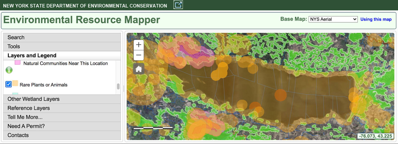
The above example showcases Oneida Lake and the surrounding area. The orange highlighted areas show rare plants or animals, the pink highlighted areas are significant natural communities, and the green highlighted areas are state regulated freshwater wetlands. This is just an example of the many areas that are available to view throughout New York. Overall, Environmental Resource Mapper is a great tool for nature lovers!
No matter what you’re wanting to map and learn about, these five free mapping resources can get you started and learn more about your community. These tools are easy to use no matter your familiarity with mapping software. Happy Mapping!